Last Friday, I mentioned that I’m working on a redesign of ye’ ol’ blog.
Cleaner, mobile-responsive, and better organized (I hope!) are a few of the goals. When I started working on it, I didn’t give much thought to the current design, but once I got it to a final-ish look, I was like WOAH! Big difference! It reminded me a lot of when we took my 2002 Toyota 4Runner (that I loved!) to the dealership to trade it in and realized… Wow. It looked so dated compared to all of the new cars. Not bad, just … dated.
Anyway, I thought I’d do a little “blog design Throwback Thursday” for you guys so you can see how far we’ve come. Which of course you probably don’t care about, but perhaps the photos of the kids will entice you to keep going (and maybe get a sneak peek of the new logo…)
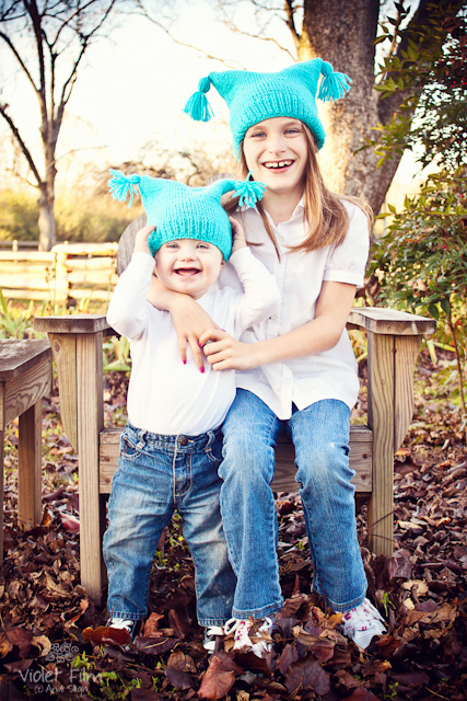
First… the ear hat photo. The original ear hat photo, anyway. I got a wild hair to learn to knit when Nathan was born and knit these hats for the kids. Why do kids living in a subtropical climate like ours need knitted hats, you ask? So their mom can take ridiculous Christmas photos of them, of course!
2011 brought … another photo with the ear hats. Like the 2010 version the year before, this ear hat photo made it onto our Christmas card.
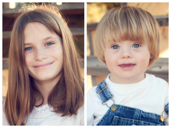
The side-by-side headshots below didn’t make into the blog header, mostly because they weren’t wearing the ear hats that perfectly matched the color scheme, but I did use them on the “Meet” pages, and of course on the Christmas card that year. NOTE: I tried and failed with the ear hats in year three.
And finally, a photo without ear hats that made it both onto the blog header and our Christmas card. It’s not very sharp, but it’s one of my all-time favorites because it’s genuine. I snapped this impromptu pic while my sister was trying to wrangle her three kids just outside the frame for an “all the grandkids on the bed” shot.
Now for a short history of my blog headers!
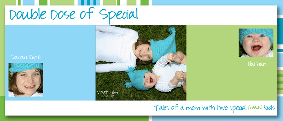
First, the original header for the precursor to this blog, Double Dose of Special, hosted at the time on Blogger (twitch). That was back in the day when the only people reading were my mom, sister, husband, and about five close friends.
In May of 2011, I figured out it took a lot more than just my fingers to count my blog readers, so I changed the name and moved up to a self-hosted WordPress blog, which led to a new header. I actually paid real money for hosting! It’s also fairly obvious that I had learned more about color correction in Photoshop by that time.
Several months later, I decided I needed an actual logo, so Mr. Andi and I created one. I still love the little girl with the slightly bent knees and the boy with the “21” jersey. I shall miss them.
In early 2012, Melissa Culbertson critiqued by blog and pointed out something that had, inexplicably, never occurred to me before: my blog’s name included the word “sunshine” yet there wasn’t a single bit of yellow (or even orange) anywhere on the site. So I swapped some of the green out for yellow and added ear hat photo #2.
And finally, sometime this summer I realized that the photo I had in the header was ridiculously old and updated it with last year’s Christmas card photo, sans ear hats. I may have to bring the ear hats back out for another photo this year. They’re just…fun.
But, alas, there will be no ear hats in the header of the new design – just a logo and a widget. Want to see the new logo? If you hate it, don’t tell me. 😉
I’m on a shoestring budget here, so I’m doing all of the design work myself. It’s a lot of fun but it’s also tedious because I know just enough code to be dangerous. Truth to be told, I’m pretty sure I’ve done everything I need to do but I’m going to wait a few more days to flip the switch because I’m afraid I’ll break something and my Mac will self-destruct a la old Mission: Impossible episodes.
So the point of all that gibberish above was to let you know that I’m really, really close to a change, but if we vanish from the blogosphere for a day or twenty, you’ll know why!
Now … ready for the new logo?




Bring it on! I can’t wait!
Love the new look!!
Can I add one teency weency comment though…?? I’m really missing the ‘next post’ button that used to hang out at the bottom of a post – I tend to only pop in once a week and catch up on a few at once so it was super handy for jumping through them!
Ha! I debated long and hard about the absence of that option when I went live yesterday and ultimately decided not to add it back, but…now I think maybe I need to rethink it!
I like it.